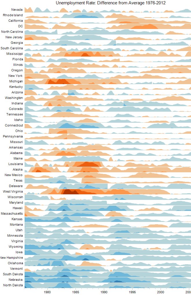
...and specifically the difference from historical averages. What the chart shows is that as more and more people have migrated to populated coastal areas, or those areas hit hardest from the recent deleveraging mean reversion depression, it is the flyover states, typically considered the least interesting, that are actually performing by far the best, with some places like North Dakota, Nebraska, South Dakota, and Vermont paradoxically having better relative employment right now than during any time in the past 40 years
Gee. I'm flabbergasted that red states are thriving while Democrat-controlled Utopias are collapsing under the weight of public sector union control, endlessly ratcheted taxes, and ever-increasing regulations.
I'll alert the media.
Oh, wait. They don't give a crap.


2 comments:
If you add a note explaining blue means improving employment and red means worsening employment, it would make the chart easier to understand.
But those colors are reversed form what they should be. If red means conservative, shouldn't blue mean worsening employment?
To see the chart with all functions
http://www.tableausoftware.com/learn/gallery/unemployment-horizon-chart
Post a Comment